📊 Analytics
Switch to the "📊 Analytics" tab in the bottom navigation to intuitively explore your spending structure and long-term trends.
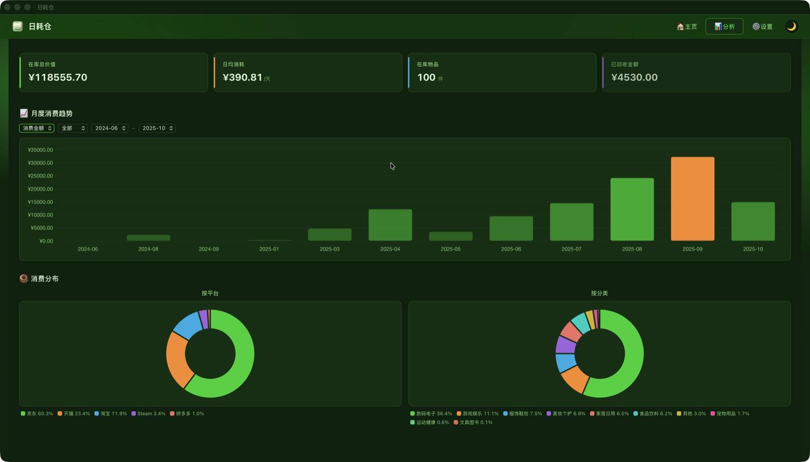
KPI Overview
Four KPI cards at the top give you a complete picture of your assets at a glance:
| Metric | Description |
|---|---|
| 💰 Total Asset Value | Total purchase price of all "In Use" items |
| 📅 Daily Burn Rate | Sum of daily costs for all in-stock items today |
| 📦 Items In Stock | Number of items currently in use |
| ♻️ Total Recovered | Sum of sale proceeds from sold items |
Monthly Spending Trends
The monthly spending chart helps you understand your spending rhythm:
- Filter by platform and time range
- Bar chart by default, with an optional cumulative spending line
- Color gradient intensifies with higher values; peak values highlighted in warm orange
💡 Drill Down: Click a month's bar in the chart to expand a spending detail panel for that month; click a specific item to jump to its detail popup.
Platform & Category Share
Twin donut charts for platform and category share clearly show where your money goes:
- Chart colors automatically follow the current theme
- Legend placed outside the chart for clarity
- Mobile layout auto-stacks vertically
WeChat Income & Expense Analysis
After importing WeChat bills, the analytics page also shows a dedicated WeChat Income & Expense section to help you understand your daily cash flow:
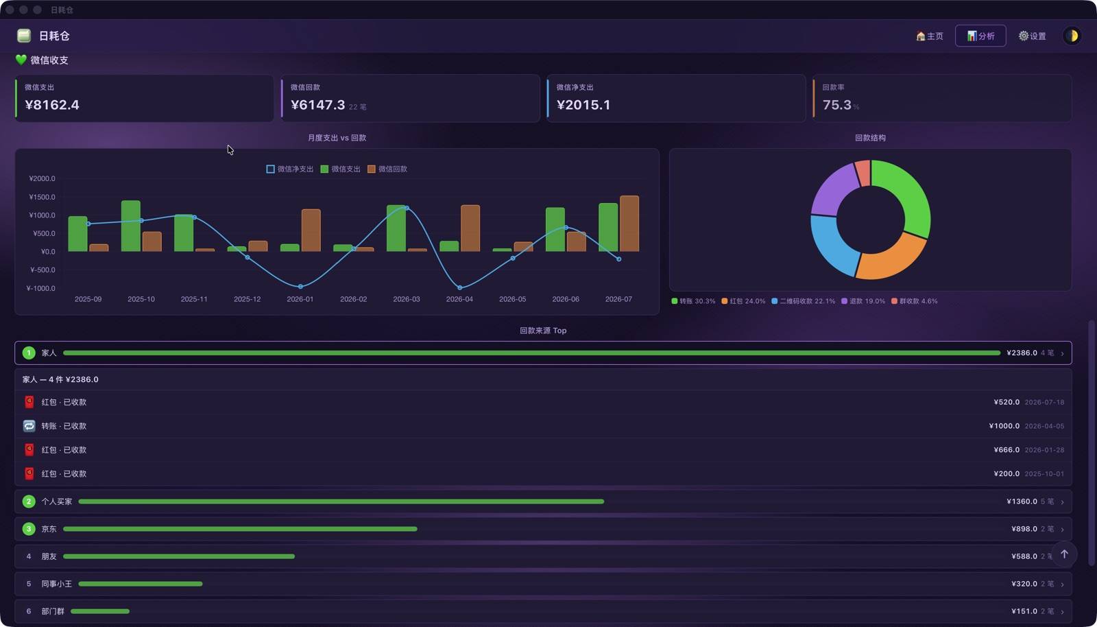
- Overview: expenses / cashback (income) / net spending at a glance
- Cashback Structure: cashback sources split by transaction type (AA transfers, refunds, red packets, etc.; "refund" types are grouped into one item)
- Top 10 Sources: cashback source ranking; click to drill down into all transactions from that source
- Monthly Income & Expense: monthly spending vs. cashback trends
💡 The WeChat section appears only when the platform filter is set to "All" or "WeChat". Cashback data is independent of asset items and does not count toward asset or spending analysis.
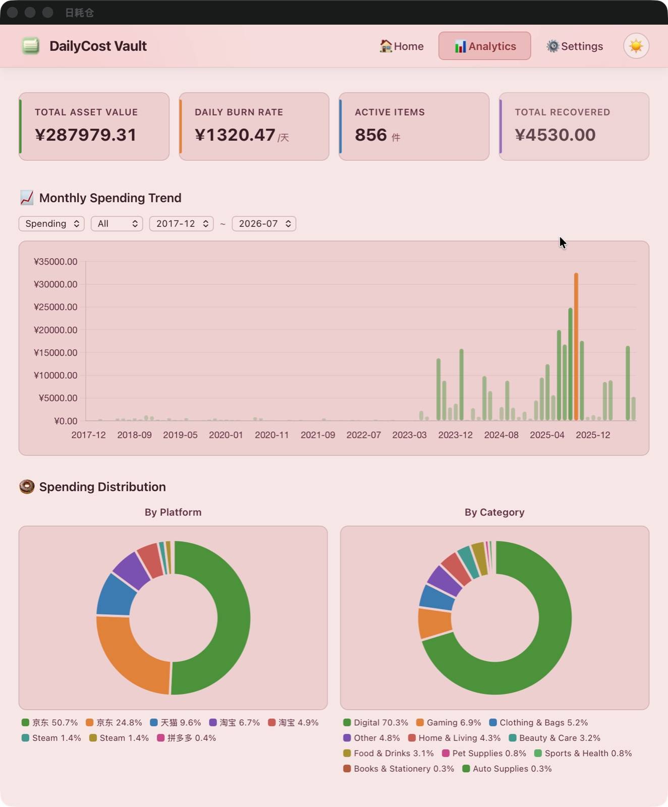
Mobile Experience
Full analytics experience on mobile too:
Next Steps
Go to ⚙️ Settings to customize your personal look and feel.